Thursday, December 29, 2011

Project of the week: The Stuff of Life: A Graphic Guide to Genetics and DNA (Book)


And now it's time to unleash the geek in me: This week's featured project is a cheery and entertaining comic that makes it easier for high school students to understand DNA.


Jargons, most of the time, discourage students to read topics further to understand the topic. It's like speaking Korean to Latin Americans. By presenting the complexity of DNA through a comic, it makes easier for students to grasp the concept of genes; it speaks in the language with which the students are familiar. That, in itself, makes the comic a success. 


Friday, December 23, 2011

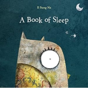
Project of the week: "A Book of Sleep" (Illustrations)

In the spotlight this week is the American book debut of illustrator Il Sung Na (via Brainpickings).


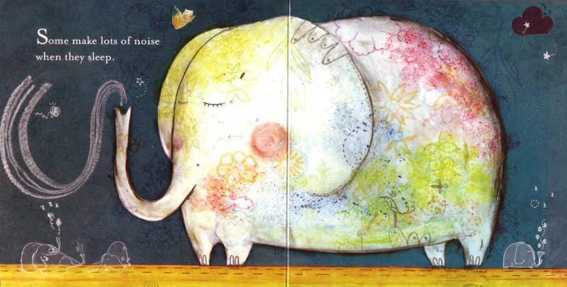
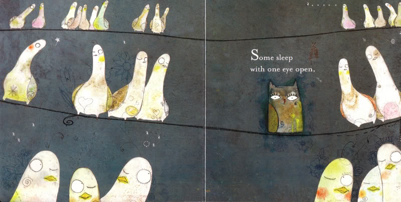
A Book of Sleep features a rhythmic storytelling of the "watchful owl" who stays awake while everyone else gets a shut-eye, through lovely and textured illustrations.


Il Sung Na's "A Book of Sleep" (Photo from www.brainpickings.org)

Il Sung Na's "A Book of Sleep" (Photo from www.brainpickings.org)

I find how the illustrations appear flowing and fluid particularly pleasant. Notice that the illustrator brilliantly used shapes and added a blush of colors to help create a subtle contrast between the doves and the owl.

While drawing for children seem easy to some, it is admittedly harder than most illustrations, because ideally the message must be conveyed in the simplest and most interesting way possible to keep the readers glued to the page. Here, less is truly more but one has to strike a balance between keeping the illustrations simple yet making it interesting and attractive visually to encourage the reader to flip to the next page. This is why I find the Il's illustrations excellent.

Friday, September 9, 2011

Design collection: Best catering logo designs for ideas and inspiration


Have you seen my list of bad catering and food service design logos? If so, then read on to find out  my top choices for the well executed caterer and catering service logos.


Good catering logo designs and tips

Logo design tip: Use color and negative space for emphasis. Even a single or dual color logo design, with proper use of negative space, makes an interesting logo. Take this Food Creatives logo. Not only the utensil illustration but also the highlighted "EAT" in CREATIVES tell the looker at first glance what this company does. And it does so effectively. 


Baja Catering's logo also uses negative space smartly to add a visual element to its logo.


 Logo design tip: Use appropriate font to show and add character in your logo design.  Font use The handwritten font with its subtle or muted colors of gray and yellow green work well together. The stout letters exudes a relaxed and playful approach to catering.


Below is another logo that uses a script-style font. Look how it's easy to read the brand Ariawan and how fun and warm the logo looks. Brown, white and yellow are an excellent choice for a classy and timeless logo. You can read about the story behind the Ariawan logo here.


Logo design tip: Use non-traditional colors to set your brand apart. It's hip and young, it looks hot and it's different. Pink may not be a popular choice among in food service design, but it certainly makes Eat Ibiza stand out of the crowd. The color choice also tells the looker that the company uses a modern approach to its services. 


Logo design: When you're unsure, stick with safe color choices. While brown and pale flesh may not be the top color choices for food services, notice that with the gradient and font execution, Catering Services Unlimited's logo exudes elegance that clients seek. Serif font, as shown in the logo, work well with cursive initials to present an overall impressive logo design.


I hope you like my shortlist of catering logos! To better appreciate these logos, maybe you should check my shortlist of bad catering logo designs.

Keep on visiting Baneneng's Portfolio for more design news and content!

Wednesday, September 7, 2011

Design collection: Bad catering logo designs - what you should not do when making a catering logo

Due to the surge of catering logo searches on Baneneng's portfolio, I thought of doing our eager searchers and googlist a favor by bringing you my shortlist for the worst catering logo designs. (Don't worry, I'm coming up with the  top catering logo designs after this so watch out for it!)

Note that a good graphic design reflects the essence of the brand. Never mind if the name of the catering company is ordinary, the least a graphic designer, illustrator or art director can do is to transform the forgettable  brand name into an unforgettable logo by using and emphasizing the right elements.

Part 1: Bad catering logo designs

Try searching catering service online and if you share my aesthetics, the logos of the top search results fall short on creativity. Nothing stands out in the design elements used in the caterer's logo. AllSuburbs, Jay's Catering, Viviani's Catering and other companies must serve a heck of a feast, but for the sake of making a point, allow me to show their logos here:


YLS Catering Services (Singapore). The logo looks annoyingly too generic. The letters YLS, while in italics, are written in a too-common font that it simply doesn't stand out. It would have looked a bit better if the cursive font was used on YLS, and the sans serif font was used on "Catering Services". But if they did that, the logo would still look bad because these fonts do not possess character at all.


All Suburbs (USA). Looking at the drawing of the chef, could you tell that All Suburbs is a restaurant, catering service company or a bakery had the phrase "Catering Service" wasn't written on the logo? I didn't think so. Ideally, the logo should not look very generic or else the looker (or worse, a potential client) would be left guessing which service your company provides. And that is bad for business.


Alfonso Catering (USA). While it shows that thought and care went into developing a signature-style logo, I cannot ignore how the letter n looks like a u. The last thing a designer wants is to have people misread or mispronounce the brand name. This is why Alfonso Catering's logo falls under bad catering logo designs.


A1 Catering (Philippines). I'll keep this one short. Because of the font choice, the logo looks outdated and the drawing, confusing. Is that a toque trying to be a heart, or is it heart-shaped balloon which oddly reminds me of a fallopian tube (I don't know why, please don't ask). Here, white overpowers the green so the brand name is de-emphasized, and the odd drawing, highlighted. 


Mmmm Good Meals. Does this logo remind you of another brand? Notice that the font and the circle for each letter m is the same as the world-renowned M&M's brand. The design semblance too goes against the company's service -- a chocolate candy certainly isn't part of a health-conscious food service.


Please note that it is not my intention to offend the logo designers of or owners of the companies mentioned above. Kindly take this as a constructive criticism and professional advice so that you could further improve your branding.

Part 2: Best catering logo designs (Coming soon)

Now that we've discussed the don'ts, it only makes sense to discuss next the do's in designing a good catering or caterer's logo. Watch out because that will come next week. Until then!

Thursday, September 1, 2011

Popular lyrics visualized: Stylized Visions on music quotes from

Project of the Week Thursday: Lyric and Song Quote Posters of MusicPhilosophy.co.uk

Note: Every Thursday, I will feature visual and visually-related projects that for me, kicks ass.

Be inspired by the vision of Music Philosophy on lyrics and song quotes.

The brains behind Music Philosophy is Mico, an advertising art director who fancies interpreting song quotes in between work or when there are no advertising jobs or clients. He used to accept lyrics and song quote suggestions, which he willingly made into a poster. With the project put permanently on hold, it seems that Mico has his hands full. So for now, we have to content ourselves with the 52 awesome poster designs that interpret the musical and lyrical geniuses and artists such as U2, Dave Matthews Band,  Pink Floyd, Michael Jackson, Bob Dylan, The Strokes, Belle and Sebastian, John Lennon, The Beatles, Pearl Jam and more.

Here are samples of works from http://musicphilosophy.co.uk/.
Note: Works are copyright of the owner. Photos are from musicphilosophy.co.uk and are merely shown here for info sharing and your enjoyment/amusement. 


Photo credits: All posters made and owned by Mico of musicphilosophy.co.uk . Drop by his site! :)

Saturday, August 27, 2011

Great news - HOW Interactive Design Awards Deadline is Extended

Heave a sigh of relief, designers, and graphic and web artists, because HOW Magazine extended the deadline from August 22 to September 1, 2011. 


Only digital, web and  broadcast works (DVD and CD-ROMS included)  produced from July1, 2010 to July 1, 2011 are eligible for submission. You can read the rest of the rules and details of HOW Magazine’s 13th Interactive Design Competition. Don't forget to submit an entry!

Below is the announcement text from the How Magazine's website:


Enter your work in HOW magazine’s Interactive Design Awards for a chance to be included in the new Web Designer’s Idea App. All winning entries will also be featured in HOW’s March 2012 Design Annual and will receive a $100 discount toward registration for the 2012 HOW Design Conference. One Best of Show winner will be prominently featured in the March 2012 Design Annual and will be our guest at the 2012 HOW Conference (round-trip airfare, hotel and registration paid by HOW).
DEADLINE: September 1


Source/Read the original entry here: HOW Magazine Blog | HOW Interactive Design Awards Deadline Extended http://blog.howdesign.com/call-for-entries/how-interactive-design-awards-deadline-extended/#ixzz1WETSPBin


Wednesday, August 17, 2011

2011 Design contests and awards - deadlines every graphic artist should know

Proud of the works you've churned out for your clients this year? Then I strongly suggest you enter your most precious work to this anticipated design awards! This might be the chance you are waiting for to catapult your name to the hall of fame. 


HOW Magazine’s 13th Annual Interactive Design Awards

(Below is the text found on How Magazine's website)
Enter your work in HOW magazine’s Interactive Design Competition for a chance to be included in the new Web Designer’s Idea App. All winning entries will also be featured in HOW’s March 2012 Design Annual and will receive a $100 discount toward registration for the 2012 HOW Design Conference. One Best of Show winner will be prominently featured in the March 2012 Design Annual and will be our guest at the 2012 HOW Conference (round-trip airfare, hotel and registration paid by HOW).
JUDGING CRITERIA
Your entry will be judged using the following criteria:
  • How well does the entry achieve its client’s mission?
  • How well does the entry communicate?
  • How easy is it to navigate the entry?
  • How strong is the entry aesthetically?
  • How strong is the entry technically?
Please include a description of the objectives of your entry with your entry form to help the judges fully evaluate your project.
CATEGORIES
  • Business-to-business Websites
  • DVDs/CD-ROMs
  • E-mail Newsletters
  • Online Promotions
  • Games
  • Motion Designs
  • Consumer Web sites
  • Kiosks
  • Self-Promotional Web sites
  • Online Advertising
  • Student Work
  • In-House Work…anything created by a designer working for a corporation (not a design firm or agency)
  • Other
WHAT’S ELIGIBLE
Work must have been created between July 1, 2010, and July 1, 2011. Any interactive, interface or motion designs for the web, for kiosks, for broadcast or for use on Macintosh or Windows platforms, including CD-ROMs and DVDs, are eligible.
ENTRY FEES
  • Regular Entry – $125
  • Multimedia Campaign – $200
  • Student Entry – $55
  • Student Multimedia Campaign – $100
A multimedia campaign is a group of related projects that work together. It could be a website with corresponding banner ads and identity (logo, etc.). It could be print and web working together.
DEADLINE
All entries must be submitted online by 11:59 EST or postmarked no later than August 22, 2011. Entries submitted online or postmarked after August 22, 2011 will not be accepted.
PAYMENT
Make checks payable (in U.S. funds, drawn on a U.S. bank) to F+W Media, Inc. Payment must accompany entries. Entries received without payment will be disqualified. Entry fees are nonrefundable. One check may be used to cover multiple entries if all entries are submitted in the same package. Credit card charges will appear on your statement as “F+W Contest” within 90 days of the contest deadline.
MAIL TO:
HOW Interactive Design Awards
4700 East Galbraith Road · Cincinnati, OH 45236
USA
HOW TO ENTER
  1. Entries may be submitted online.Simply provide the website URL or upload the files. All other entries may be registered online. You would then send in samples with a copy of your online entry form.
  2. For all entries submitted offline, send two well-protected disks or CD-ROMs for each entry. Submit your entry on DVD or CD-ROMs (Mac or Win). Include instructions for loading and running the entry. Web sites may be entered on one of these formats or by providing the URL for the site. Include password if entry is protected.
  3. Complete an entry form and make three clear photocopies of it. Firmly attach one form to each copy of your entry, and include the other two forms with your payment.
  4. Type or print your entry form. Entries accompanied by illegible forms will be disqualified.
  5. Mail entries to:
HOW INTERACTIVE DESIGN AWARDS
4700 East Galbraith Road
Cincinnati OH 45236
IMPORTANT
Winning entrants grant HOW the right to reproduce images of their work in HOW magazine and to display the projects at HOW events. Some winning entries may also appear on HOW’s website and in other digital and printed materials. HOW assumes all entries are original and are the works and property of the entrant, with all rights granted therein. HOW is not liable for any copyright infringement on the part of the entrant and will not become involved in copyright disputes. If you wish to be notified of the receipt of your entry, please enclose a self-addressed, stamped postcard. HOW will notify winners by mail in March 2012, after judging is complete. No entries will be returned.
PRIVACY PROMISE
Occasionally, we make portions of our customer list available to other companies so they may contact you about products and services that may be of interest to you. If you prefer we withhold your name, simply send a note with your name, address and the competition name to: List Manager, F+W Media, Inc., 4700 East Galbraith Road, Cincinnati, OH 45236 USA.
For additional information email HOW-interactive@fwmedia.com.

Tuesday, August 16, 2011

Latest design news: Adobe releases Muse for codeless web design, free download!

Adobe recently release its newest product, Muse. According to its website, Muse lets you create web design by forgoing the code and focusing on the design, just as you layout print. In short, you don't have to worry about the technicalities of code because Muse lets you create sites simply by design.

While this sounds like a rad program, a review by Imprint pointed out some highs and lows of the program.

The great things about Adobe Muse: 
1. Lets designers easily transition from print to web design
2. Familiarity: Adobe uses similar interface as Adobe InDesign, which is used to create layouts for book and similar projects.

What needs to be improved in Adobe Muse:
1. Fonts appear slightly different in Adobe Muse.  See photos below from Imprint for comparison:

From Imprint: "incorrectly specs typefaces like Futura, Century Gothic and AppleGothic in its paragraphs without an embedding service like TypeKit, and in incorrect syntax. It's output incorrectly straight from Muse. It should actually look more like this:"


While this is from Imprint, I suggest you head over to Adobe Muse's website and see for yourself how this new program could be useful for you. You can view the features of Adobe Muse here and create trial sites to check if your next design for a client would lead to your debut on Adobe Muse.

Download Adobe Muse for free: Though still in Beta mode, you get get a FREE COPY of ADOBE MUSE by downloading it here now. Adobe is giving away Muse for free until its version 1.0 release in 2012, during which it will be sold for US$180 for a one year plan or US$20 per month. So grab a free copy today!

Source:  Today's Obsession: A First Look at Adobe Muse — Imprint-The Online Community for Graphic Designers

Tuesday, August 9, 2011

Free wallpaper: Never Sell Yourself Short by Baneneng- Download now

Inspiration wallpaper - Get your free wallpaper here!

To all independent artists, striving entrepreneurs, and professionals of all sorts, let me share with you a wallpaper I made.

As artists eager to make a living, some times we find ourselves in a situation where we unfortunately short sell ourselves just to land a project.

For a startup entrepreneur or newbie feelancer, this might seem like a good idea but actually, selling yourself short will hurt your business more than you think. Not only will you work more for a small payment, but in the future, should that client become your repeat customer, he or she might ask more deliverables or freebies from you while ironically insisting on a discount too -- since you have a longstanding business relationship.

So heed my message, NEVER SELL YOURSELF SHORT.  A good artwork or design doesn't come at a dime a dozen. Believe that your worth has a value and show your client that this is true. Do your job well and give them the impression of genuine increase in their business by getting you as their artist, and they will be happy to pay your professional fee.

So here you go, folks. Your free, original wallpaper by Baneneng available for download! Enjoy! :)

Free wallpaper

Ideal for Graphic artists, freelancers and independent professionals
Size: 1028 x 768 px (request for other sizes by leaving a comment here)
Copyright: All rights reserved 2011 - Free to distribute for strictly non-commercial use only


"Never Sell Yourself Short" FREE WALLPAPER by BANENENG
All rights reserved 2011 - Free to distribute for strictly non-commercial use only


How to save the file:

  1. Right click on the photo below.
  2. Choose "Save Link As"
  3. Specify the folder destination of the file and Click Save/OK button.
  4. Go to the folder destination and set the photo as your desktop background! :)

Saturday, August 6, 2011

The worst, the horrible and the tasteless: My top 7 worst logo designs

What were they thinking?

To better appreciate the best logo designs posted here earlier, I'm sharing with you my Top 7 Worst logo designs. Keep in mind though that while my intention here is not to ridicule the designers or companies or organizations that own the logos below, I am showing this to the world as a reminder of things to do avoid when making a logo.


The worst, the horrible and the tasteless: The Worst logo designs


Dick Clark Entertainment. Okay, yes, the company is very successful. The management is obviously have the ability to operate the business, but whatever foresight they have in the future of entertainment, they certainly lack that when it comes to design. Let me make a guess. Are the owners all men? Perhaps they thought it was a joke to make the logo be a visual pun of Dick (Clark). But how could you expect reputable business people to respect you when every time they see your company logo, all they remember is a wiener.


Same reason as above.


Anthony Byrne. This again. Seriously, what's up with this? Why is this a favorite? Is the designer or owner subconsciously so insecure of themselves or does this logo succinctly summarizes the owner's potential? Or is the owner a victim of bad design and bad advice?


Catholic Church’s Archdiocesan Youth Commission. The logo displays good use of negative space but bad choice of an image. When I first saw this logo, what first came to my mind was the growing child abuse complaints against some of the member of its ranks. Could you say then that the designer had a foresight? Hmm.


Here's another example of using negative image in a bad way. Or maybe the client pissed off the designer that he or she used the logo as a vendetta.


Locum Property Management. Supposedly read as "Locum", this logo represents a Sweden-based property management firm. Go here to view the original material for this logo.


A-Style is a clothing and lifestyle brand that operates in Europe, China and Japan. Believe it or not, the company is still using this logo! I wonder if the managers have seen blogs and design sites that have elevated A-Style's logo to the Worst Logo Design Ever Hall of Fame. See this badly designed logo in action at A-Style's website.


Friday, August 5, 2011

Design collection: The best and most creative typographic logos

What's in a logo?


A good logo summarizes all the brand qualities in a nutshell. It is meant to say a lot but in a minimal way because, in the world of design, less is always more.

Logo design styles and types vary too. Some designs revolve around the type or the word, while others focus on creating an iconic symbol for the brand. It all depends on the client's requirements, really. But in my book, typographic logos are superior over the other types. And making them are more nerve wrecking that you can imagine! That is why you should never take seriously a designer who claims that he or she can produce a logo for company logo in 24 hours. Either you will be broken with what you will see, or you simply have no taste in design (ouch!).

Awesome typographic logo designs for your inspiration

Let me share with you a collection of the best typographic design. These designs weren't made by me, but they look simply glorious that they deserve every possible space of the design-related blogosphere. The artists whose minds gave birth to these logos rightfully merit a slot in the Eternal Fame of Design:


FOOT logo: It was at second glance that I started to love this design.


XMAS: Great use of negative space.
WrongRight: How can a logo be so simple and yet be so brilliant?

Half: A perfect example of how a logo design reflects the holistic message or essence of the brand.


Half: Another brilliant example of the company's message illustrated in the logo design.


For more brilliantly designed logos, check out this collection.